As you walk through the office at work reading the news on your phone, you enter an elevator. You had just attempted to load a new page only to be greeted with a painful loading spinner. No one likes this experience.
It's inevitable that some users of your application will have slow connections. A well thought out design accounts for varying internet speeds and displays a loading state to the user. However, making the user stare at a spinning wheel for an extended period of time can drastically increase bounce rates. What if there was a better way?
Skeleton Screens
Skeleton screens build anticipation for the content that is going to appear whereas loading spinners (and progress bars) put the focus on the wait time that the user has to endure. Apple has agreed with this idea enough to incorporate skeleton screens into their iOS Human Interface Guidelines. They recommend displaying an outline of the initial application without text or any elements that will change. This can improve the feel of any action taking longer than a few hundred milliseconds.
Examples
By now, you've probably seen some examples of skeleton screens in your daily browsing without even noticing. For example - Facebook shows users gray circles and lines to represent the contents of a post in their timeline.

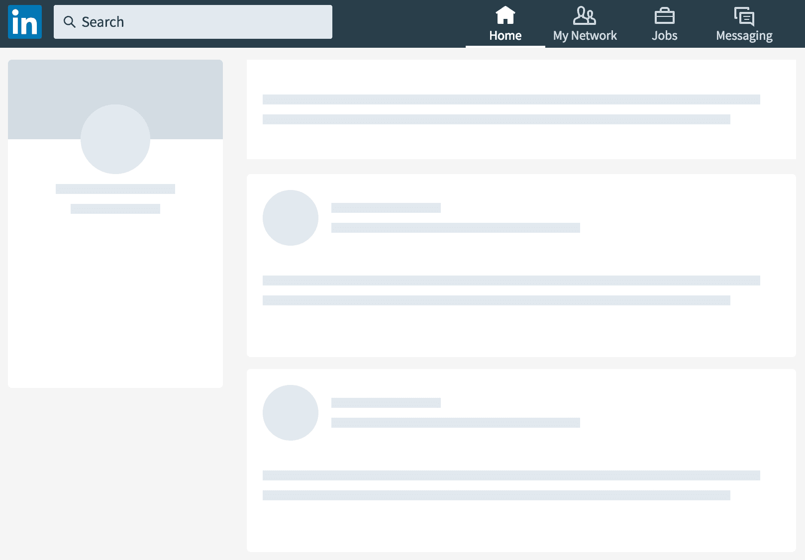
It's not just Facebook either. LinkedIn has also re-designed their layout to use placeholders.

You can trick your users into thinking your website loads faster using skeleton screens. Let's look at how you can actually create this effect using some simple HTML and Scss.
Building a Placeholder
First, let's create the base structure. In this example, the placeholder is supposed to represent a text area. We'll use BEM (Base - Element - Modifier) naming for our classes.
<div class="text-input__loading">
  <div class="text-input__loading--line"></div>
  <div class="text-input__loading--line"></div>
  <div class="text-input__loading--line"></div>
  <div class="text-input__loading--line"></div>
  <div class="text-input__loading--line"></div>
  <div class="text-input__loading--line"></div>
  <div class="text-input__loading--line"></div>
  <div class="text-input__loading--line"></div>
  <div class="text-input__loading--line"></div>
  <div class="text-input__loading--line"></div>
</div>
Each line should be about the same height as our text. We can use CSS animation to create a pulsating effect.
&--line {
  height: 10px;
  margin: 10px;
  animation: pulse 1s infinite ease-in-out;
}
Next, let's define how our pulse animation should work. We can modify the opacity of the background color using rgba to provide an opacity between 0.0 and 1.0.
@keyframes pulse {
  0% {
    background-color: rgba(165, 165, 165, 0.1);
  }
  50% {
    background-color: rgba(165, 165, 165, 0.3);
  }
  100% {
    background-color: rgba(165, 165, 165, 0.1);
  }
}
We also want to vary the width of each loading line. Let's create a Sass mixin to apply the given content to each nth-child in a list.
@mixin nth-children($points...) {
  @each $point in $points {
    &:nth-child(#{$point}) {
      @content;
    }
  }
}
We can use the newly created mixin to change the width of all 10 children div elements.
@include nth-children(1, 5, 9) {
  width: 150px;
}
@include nth-children(2, 6, 10) {
  width: 250px;
}
@include nth-children(3, 7) {
  width: 50px;
}
@include nth-children(4, 8) {
  width: 100px;
}
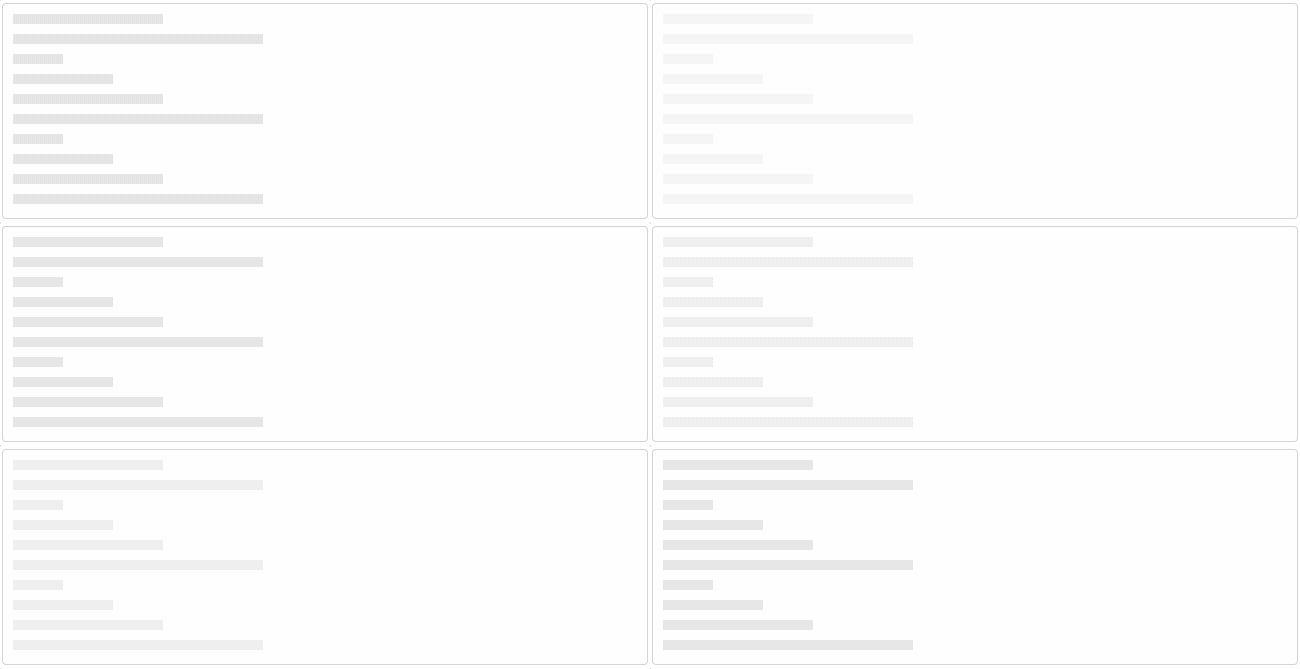
Final Result 🎉

You can view the code and a live example on CodePen. There's also a React library called react-placeholder that achieves the same effect.
Further Reading: